PORES SKINCARE
IDENTITY | BRANDING | packaging design | VISUAL & VERBAL LANGUAGE | communication pegs | DIGITAL LOOK AND FEEL | WEBSITE DESIGN & KEY MESSAGING
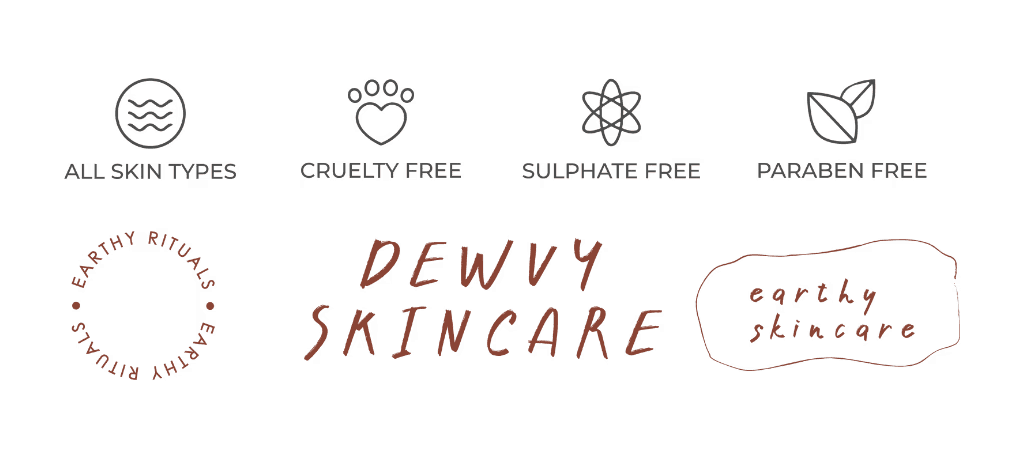
Pores is a new earthy skincare brand that aims to celebrate natural beauty and provide effective and ethical skincare solutions. The brand is launching a range of products, including cleansers, toners, moisturisers, and masks, for different skin types and concerns. The products are made with natural ingredients, sourced from organic and fair trade suppliers, and are vegan, cruelty-free, and eco-friendly.

The Name
Pores are the natural openings that connect your skin to the earth. That's why our products are made with organic and eco-friendly ingredients that respect your pores. "Pores" makes a statement, acknowledging the importance of this often-ignored aspect of skin health. This can resonate with customers seeking honest and transparent skincare solutions.
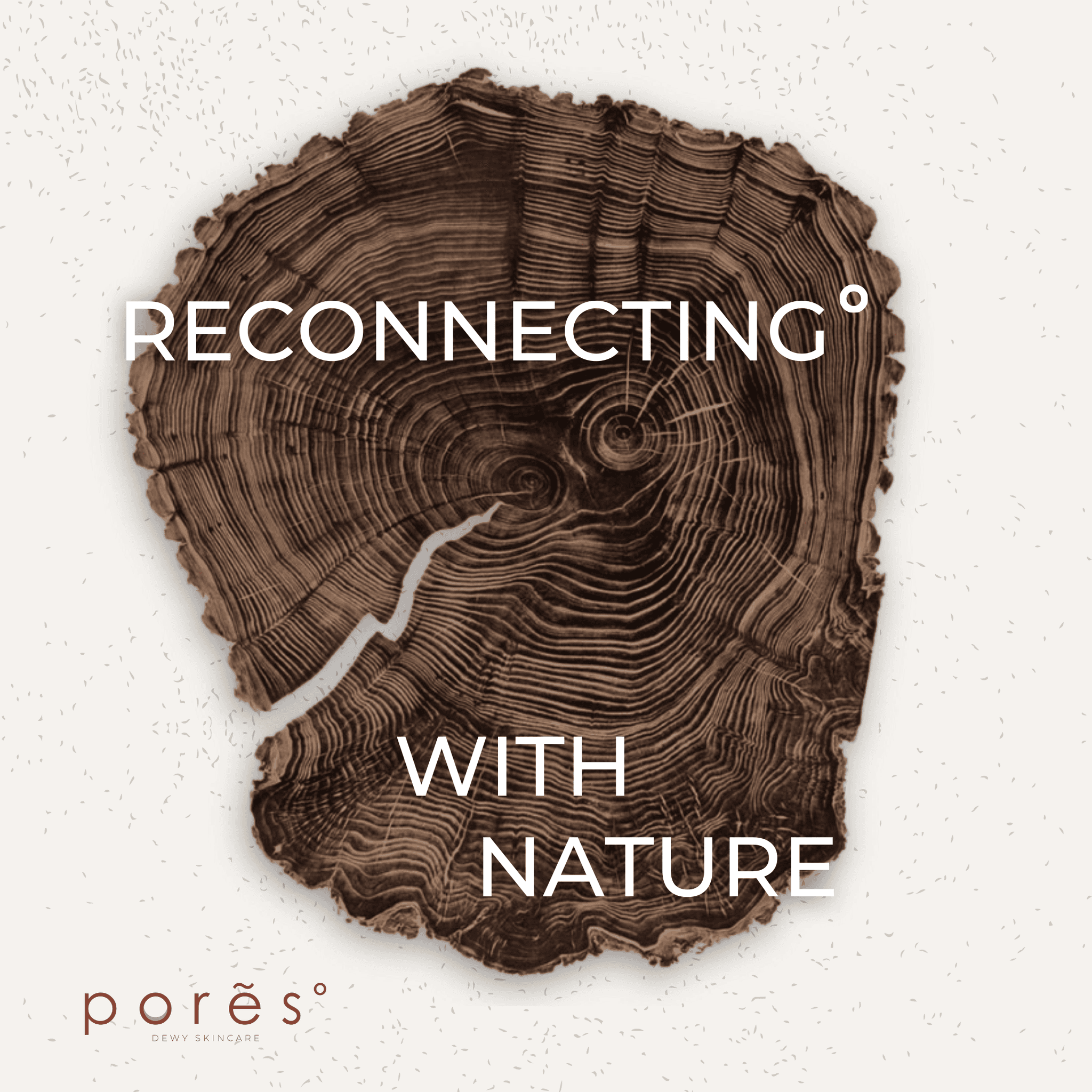
From the outset, we understood that individuals seeking solutions for pores often grapple with self-consciousness and negative societal perceptions. We challenged the narrative that pore care adds to this burden, posing the question:
Why should prioritising healthy pores be seen as another layer of complexity ?
THE LOGO
Our logo comes from the thought of being comforting, earthy and approachable to our consumers. The logo of Pores is a stylised representation of a pore, with a circular shape and a crescent in the centre. The logo symbolises the idea of cleansing and nourishing the skin from the inside out, as well as the concept of minimalism and simplicity. The logo design also reflects the brand’s target audience, who are likely to appreciate the natural and refined style of the products.

THE CUSTOMER
Pores customers are conscious about their skin health and appearance, and who are looking for natural and effective solutions to improve their skin condition. Pores customers are mostly young adults, who live in urban areas and have busy lifestyles. Pores customers are also environmentally and socially aware, and prefer brands that are cruelty-free, sustainable, and ethical. Pores customers value quality, innovation, and authenticity, and are willing to pay a reasonable price for products that deliver results.
We have a passionate and knowledgeable team of skincare experts who are dedicated to creating solutions that are tested and proven to be gentle and effective on all skin types. Our products are formulated with natural and powerful ingredients that are backed by scientific evidence and cutting-edge research on how the skin works and what it needs. By being honest and transparent about our methods, we empower our customers to make smart and beneficial decisions for their skin and their loved ones.
The result is a special set of curated products based on our customer’s needs, not category trends.
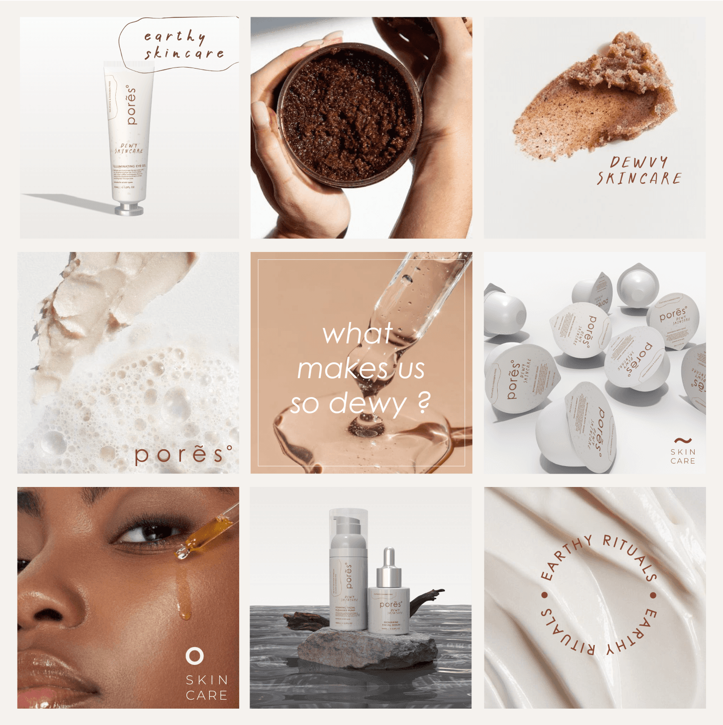
Earthy Skincare : Pores

THE PACKAGING DESIGN
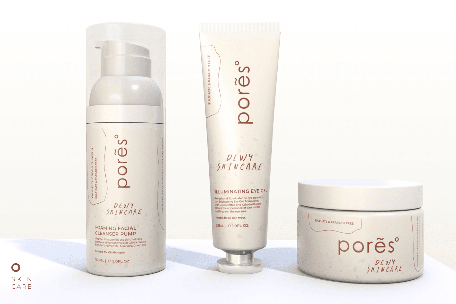
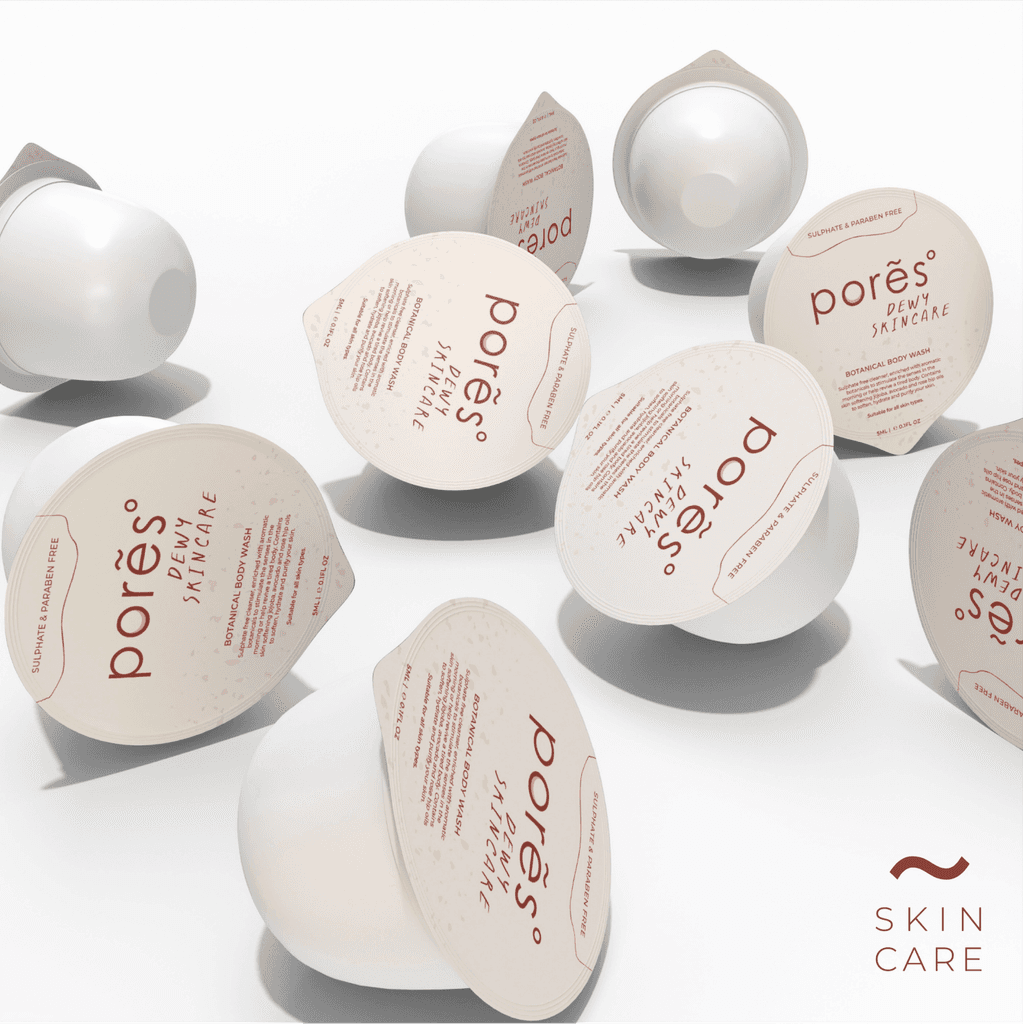
The packaging design process for Pores skincare products was guided by the brand’s values of simplicity, effectiveness, and sustainability. The packaging design of its products reflects this philosophy by using simple and elegant elements that create a sense of harmony and freshness.
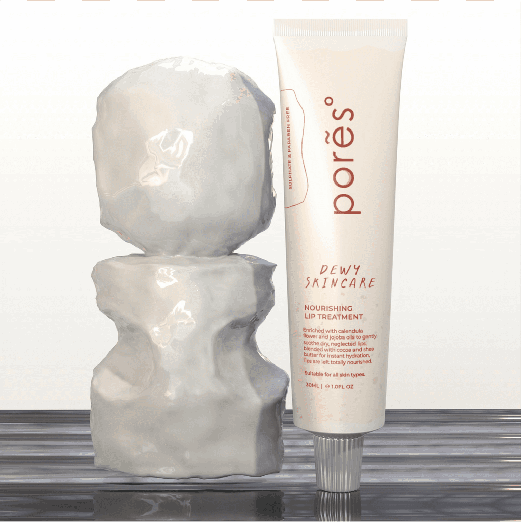
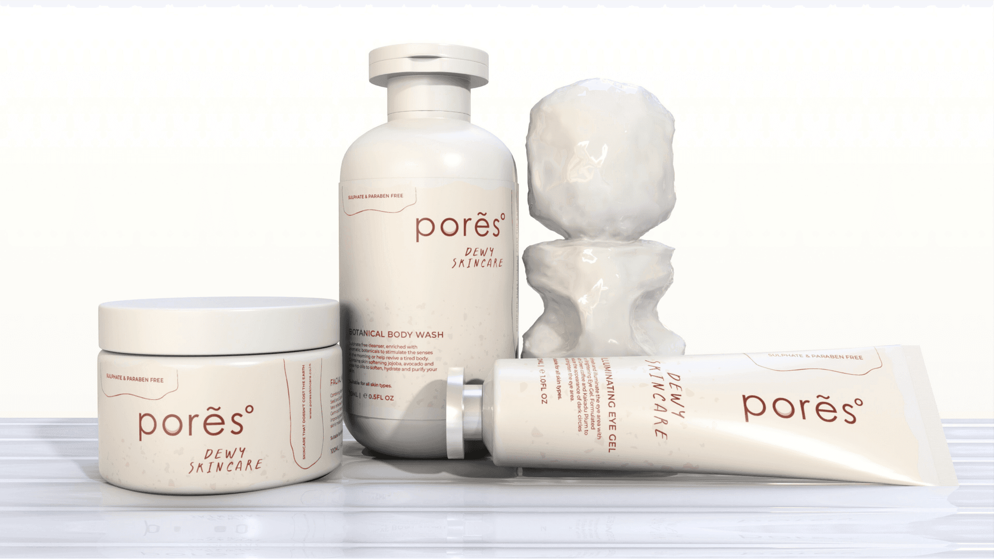
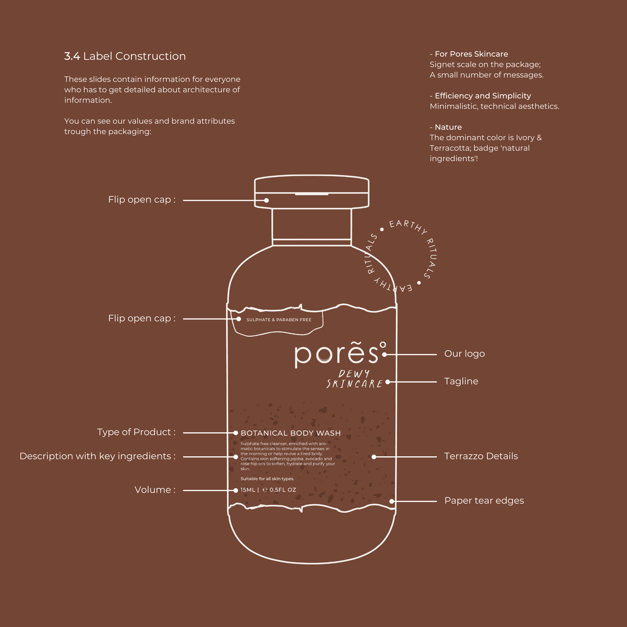
We suggested bevel to all custom containers, and simplicity of information that didn’t require deep study. Paper torn label edges detail, irregular outlines, portrays the earthy details and contours. One of the most distinctive elements of the packaging design is a brown stone-like object that is placed among the label. This object stands out due to its natural texture and colour contrast, and it symbolises the brand’s connection to soil, representing earth’s pores.
We additionally created a few key elements & icons that reinforced the brand idea and promise to the Pores customers.


Range of products (primary containers)
THE PACKAGING MECHANICS
To create a memorable and trustworthy brand identity, we have developed a consistent and coherent system for product naming, labeling, and packaging. All our products follow the same naming convention, using simple and elegant words that highlight the natural ingredients and benefits of each product. We have also designed the packaging and labeling of each product to comply with the regulations and to provide the necessary information that our customers are looking for. Our packaging and labeling design uses minimal and harmonious elements that reflect our brand philosophy and style.
Additionally, it aids future product development, and retains all the essential brand assets across varying sizes.
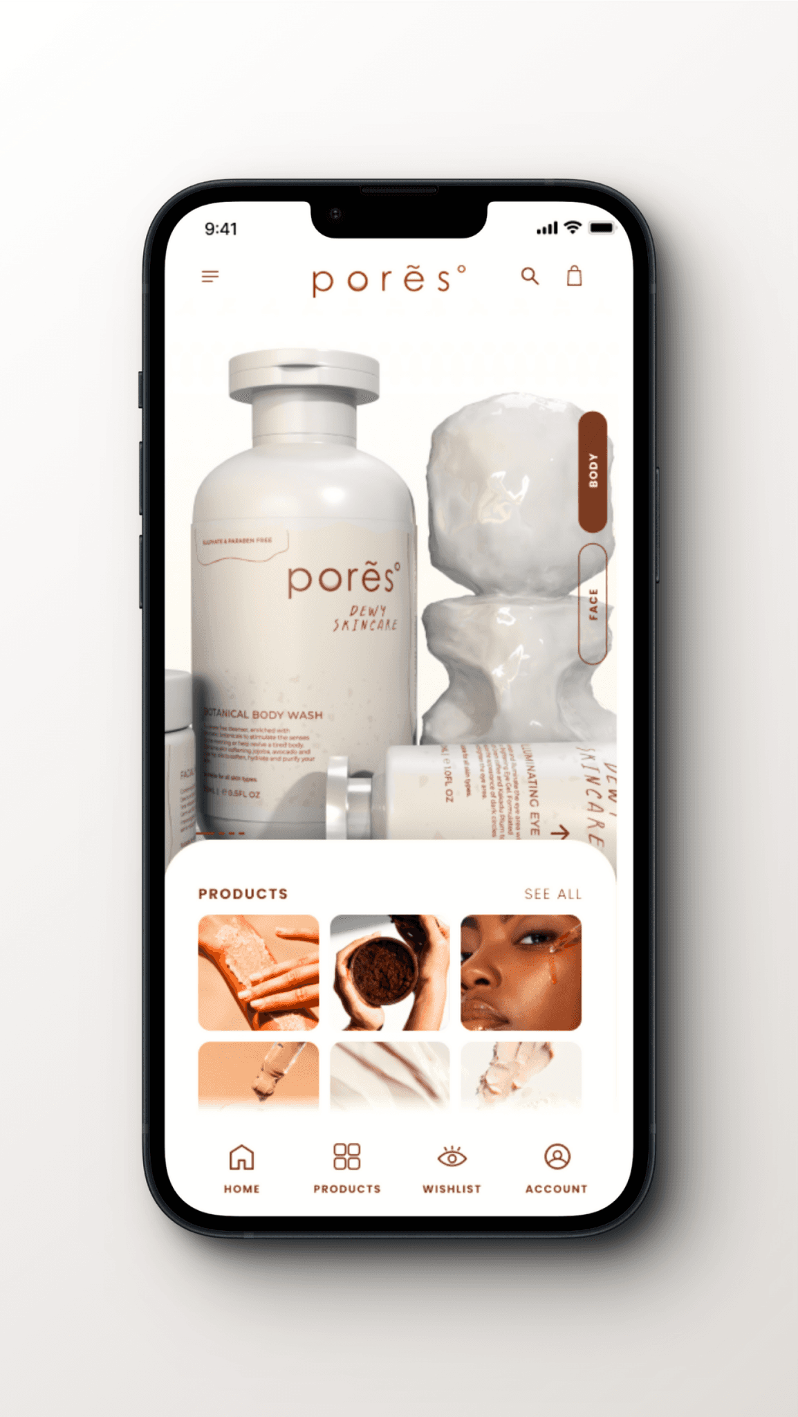
THE COMMUNICATION
When we brand, scaling with intention is key. To ensure a cohesive brand experience, we've meticulously crafted visual and textual style guides.
For Pores, we identified unique brand differentiators while maintaining crucial elements expected within the skincare category and for our specific products. This approach guarantees consistent communication across all touch points, fostering brand recognition and trust.
About
Contact
DISCLAIMER
©COPYRIGHT The Design Theories 2024. ALL RIGHTS RESERVED.